
NEWS
Equal Earth’s 2018 Bet Just Won a UN Majority
Three cartographers designed Equal Earth in 2018 so schools would drop Gall-Peters. A 164-1 UN vote now backs equal-area maps, while phones still run Mercator.

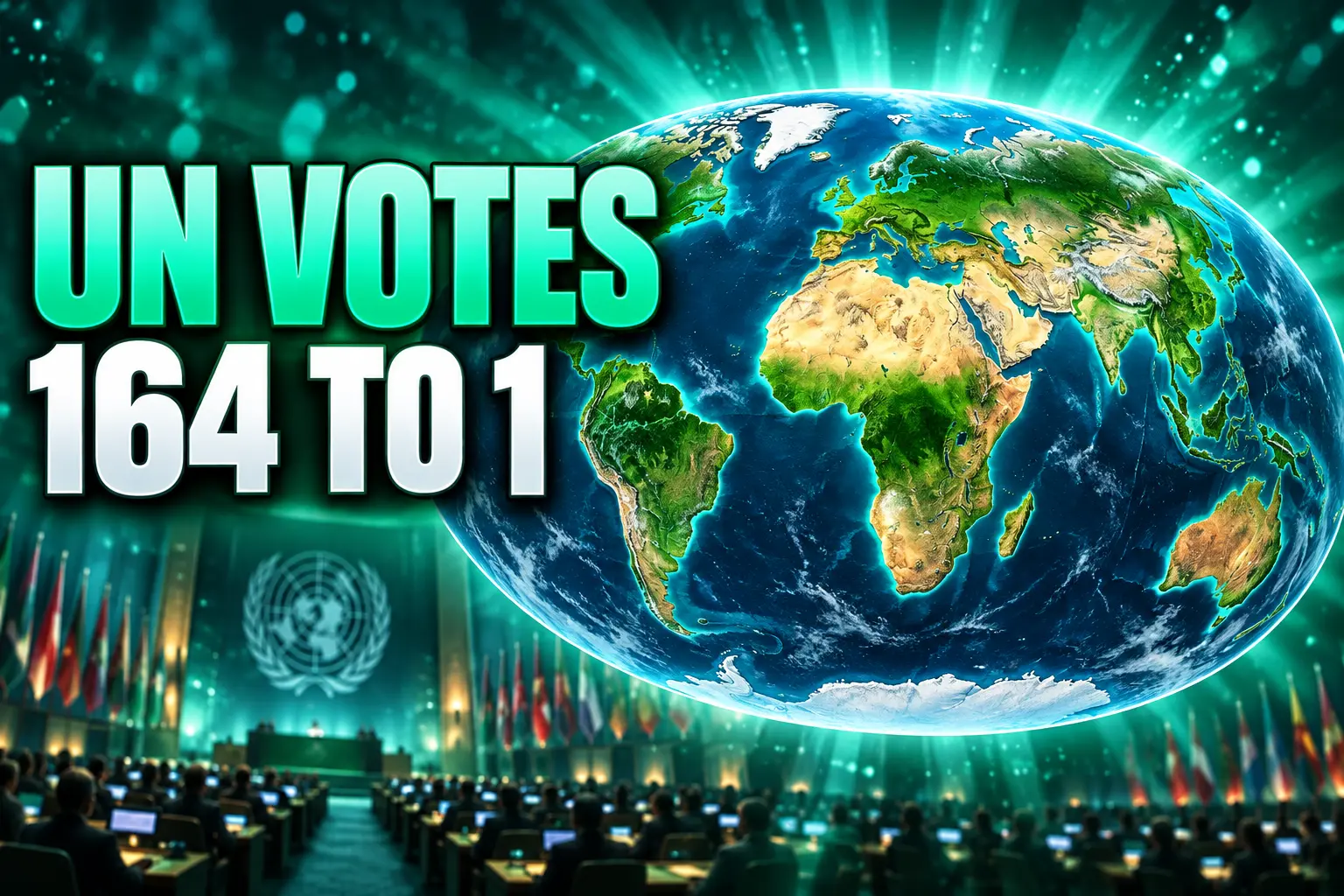
The UN General Assembly voted 164 to 1 on September 4, 2026, to push schools and institutions toward equal-area world maps such as Equal Earth. The United States cast the only no vote, and six countries abstained. The map that made that majority possible was a 2018 design, drawn after Boston schools hung Gall-Peters charts and working cartographers walked away.
The resolution, listed as A/80/L.104 and titled Correct the Map, does not ban the Mercator projection, pick a single official UN sheet, or take Mercator off a phone. It asks governments, publishers, and platforms to phase Mercator out of most non-navigation uses and to prefer equal-area drawings, with Equal Earth named as an option.
The UN Voted 164 to 1 for Equal Earth
Togo carried the draft for the African Group, with The Bahamas among the co-sponsors, at the 80th session in New York. Togo had asked members to take up the map in April 2026, and the Assembly held consultations in July. Of 193 member states, 164 voted yes. Estonia, Georgia, Lithuania, Moldova, Serbia, and Ukraine abstained. The United States voted no.
THE TALLY ON SEPTEMBER 4
- Yes: 164 member states, including the African Group that wrote the draft.
- No: the United States, the only country to oppose the text.
- Abstain: Estonia, Georgia, Lithuania, Moldova, Serbia, and Ukraine.
- The paper: A/80/L.104, Correct the Map, a non-binding encouragement, not a ban.
Togo’s text said Mercator’s shrinking of Africa and other equatorial regions had lasting effects in classrooms, culture, and politics. The African Union Commission chairperson, Mahmoud Ali Youssouf, welcomed the vote the same day and asked schools, publishers, and digital platforms to move, over time, toward drawings that match actual land area.
Congratulations to the delegation of #Togo 🇹🇬 and the Africa Group on the adoption this morning by the #UNGA of resolution A/80/L.104, “Correct the Map.”
First endorsed by the African Union Assembly in February and officially passed at the United Nations today, this… pic.twitter.com/wHxblZ8d3K
— African Union (@_AfricanUnion) September 4, 2026
Moky Makura, executive director of Africa No Filter, had already called the Mercator picture of Africa the world’s longest misinformation campaign and said it had to stop. Fara Ndiaye, co-founder of Speak Up Africa, said the old proportions hit identity and pride, especially for children who meet that map early. Those two groups started the Correct the Map campaign that the AU endorsed in August 2025. The AU Assembly backed it in February 2026 and asked Togo to take it to New York.
Boston’s Classroom Switch Set the Clock
The wager that just got a UN majority did not start in New York. It started in Boston in March 2017, when the public schools put Gall-Peters maps into social studies rooms in grades 2, 7, and 11. The district sent out about 600 laminated 24-by-36-inch sheets, at a cost of about $12,000, and said it believed it was the first U.S. public system to make that switch as policy.
Hayden Frederick-Clarke, then director of cultural proficiency, said 86 percent of the students were students of color, and that many had family ties to places the old wall map showed too small. Colin Rose, then assistant superintendent for opportunity and achievement gaps, called the change the start of a three-year effort to decolonize the curriculum. Mercator maps were not stripped from every wall. New purchases were to be Peters maps.
News coverage treated Gall-Peters as the fair alternative, and in some tellings as the only equal-area world map. That is the claim that irritated professional mapmakers. Gall-Peters keeps area, which is the point Boston wanted. It also stretches the tropics into long slabs and crushes the poles into a ribbon, which is why so many cartographers have disliked it as a classroom world map since Arno Peters revived James Gall’s 19th-century idea in 1974.
Three Cartographers Bet on a Prettier Map
About a week after those Boston stories, Tom Patterson, then a cartographer with the U.S. National Park Service, went looking for an equal-area world map that schools could hang without the Peters look. He did not find one he liked. He called Bernhard Jenny at Monash University and Bojan Šavrič, a software engineer on Esri’s Projection Engine team, and asked if they would build one.
They wanted the familiar silhouette of Arthur H. Robinson’s 1963 compromise map, which publishers already trusted, with the one property Robinson lacks: true area. They blended traits of Eckert IV and Putniņš P4ʹ in a web tool Jenny had written, took comments from other mapmakers on the outline, and then Šavrič wrote equations that were, in their own description, simple to implement and fast to evaluate. The August 2018 journal paper ran in the International Journal of Geographical Information Science, volume 33, number 3, pages 454-465, after the journal received it on April 6 and accepted it on July 23. By the winter 2019 Esri account, it had drawn more than 12,000 views.
That was the bet. If the drawing looked like a map people already knew, institutions that had bounced off Gall-Peters might actually use an equal-area sheet. The three of them said, when they published, that equal-area maps were not a cure-all and that continental shapes still suffer. They meant Equal Earth for cases where true area was required. They have since been surprised by how far the UN took it.
FROM BOSTON TO THE ASSEMBLY
- March 2017: Boston Public Schools put Gall-Peters maps in selected social studies rooms.
- August 7, 2018: The Equal Earth equations go online in the journal.
- August 2018: NASA’s Goddard Institute for Space Studies puts the projection on monthly global temperature maps.
- About October 2018: The EPSG geodetic registry adds Equal Earth coordinate systems, two months after publication.
- August 2025: The African Union endorses the Correct the Map campaign.
- February 2026: The AU Assembly backs the push and Togo takes it to the UN.
- September 4, 2026: The General Assembly adopts A/80/L.104 by 164 to 1.
Patterson also drew a political wall map in bright school colors, with light relief and three centers: Greenwich, 150 degrees east, and 90 degrees west. Those three downloadable wall-map versions are still offered free, which is how a lot of non-GIS readers first saw the projection.
Greenland Holds 7 Percent of Africa’s Area
On a Mercator classroom map, Greenland can look like a peer of Africa. Greenland has 7 percent of Africa’s land area. The African Union’s own campaign line, that Africa is about 14 times larger, is that same ratio said the other way. Equal Earth is built so a country that covers twice the ground of another country takes twice the ink.
Mercator, drawn in 1569 for sailors, keeps angles and shows a constant compass bearing as a straight line. Area explodes toward the poles because that is the cost of those bearings. Robinson, still common in atlases, looks calm and is not equal-area. Gall-Peters is equal-area and harsh on shape. Equal Earth sits in the last camp with visually pleasing and balanced outlines, curved meridians, and straight parallels. The projected equator is about 2.05 times the central meridian. The poles are lines about 0.59 times the equator, not points, so there is room for labels.
HOW THE MAIN WORLD MAPS TRADE ACCURACY
| Projection | Year | What it keeps | What gives way |
|---|---|---|---|
| Mercator | 1569 | Angles and compass bearings | Area, badly toward the poles |
| Robinson | 1963 | A familiar, rounded look | True area |
| Gall-Peters | 1974 | Area | Shape, with long tropics and a crushed pole |
| Equal Earth | 2018 | Area, with a Robinson-like outline | Shape, with poles drawn as lines |
Chris Brackley, a cartographer, wrote after the vote that Canada and Russia look squished at the top of Equal Earth, and that the UN chose the story the projection tells, comparable area, over the one Winkel tripel tells, calmer shapes. National Geographic has long used Winkel tripel for world maps, a compromise that is not equal-area. The UN text is about equity of area, which is why Equal Earth, not Winkel tripel, is the drawing the campaign took to New York.
The United States Cast the Only No
Washington called the resolution superfluous and said it promoted a radical ideological project of reparations and cognitive justice. That is the only no in the room, and it matches a split that was already in the campaign. AU officials tied the map to how the world values Africa. Selma Malika Haddadi, deputy chairperson of the AU Commission, said it might seem to be just a map, but in reality it is not. The U.S. line treated that framing as the problem.
A fair map does not change the geography of the world; it changes how we see the world.
Robert Dussey, Togo foreign minister
Ukraine sat out for a different reason. Maps Tom Patterson published on equal-earth.com showed Crimea in a different color from Ukraine. Andriy Melnyk, a Ukrainian representative, called that wholly unacceptable and said it clashed with the UN’s refusal to accept Russia’s 2014 annexation attempt. After the vote, Japanese diplomats asked Patterson to look at the Kuril Islands, which those maps showed in the same color as Russia. The fight was no longer about Africa’s area. It was about which line a pretty equal-area wall map prints as fact.
WHERE THE YES VOTE STOPPED
- United States: Called the text superfluous and an ideological project, and voted no.
- Ukraine: Abstained over Crimea’s color on Patterson’s published maps.
- Japan: Raised the Kuril Islands coloring with Patterson after the vote.
- France: Foreign minister Jean-Noël Barrot said France will stop teaching Mercator in schools.
The loudest posts on X treated 164 to 1 as a dumping of Mercator, and some of the cheers for Africa’s true size slid into a claim that the continent has spare land. That argument is not in the resolution. The Assembly voted on how area is drawn, not on who may live where, and it did not take Mercator off navigation charts.
Phones Still Open on a Mercator Grid
The 2018 bet was that code would follow if the drawing looked right. On that narrow test, the authors already won years ago. NASA’s Goddard Institute for Space Studies put Equal Earth on NASA temperature maps a week later. The International Association of Oil & Gas Producers added Equal Earth systems to the EPSG registry about two months after the paper. The projection is in QGIS, ArcGIS Pro, GeoServer, PROJ, D3, G.Projector, Panoply, MAPublisher, and Geocart. Mapbox supports it, though as of September 2026 only with the central meridian fixed on Greenwich. A World Bank spokesperson said the bank already uses Winkel tripel or Equal Earth for static maps and is phasing Mercator out of web maps.
The map most people still open is not that list. Web and phone maps commonly default to Mercator tiles because a rectangular grid wraps east to west without a seam, which is how a slippy map avoids an edge of the world. Equal Earth is a world-map projection. It is a poor fit for the square tiles in a navigation app. The UN vote does not rewrite that plumbing, and the authors never claimed it would.
France’s school announcement is the first rich-country curriculum move tied to the vote. Ndiaye had already said her group was working to make Equal Earth the main standard in African classrooms. Textbook houses, exam boards, and the default projection in a GIS export dialog are the slow machinery the 164 yes votes now lean on. Patterson’s wall maps are free. The equations are in the libraries. The Assembly did not put them on the home screen of a phone.
Frequently Asked Questions
What Is the Equal Earth Projection?
Equal Earth is an equal-area pseudocylindrical world map designed by Bojan Šavrič, Tom Patterson, and Bernhard Jenny, with equations published on August 7, 2018. Parallels are spaced by a polynomial, and the outline mixes Putniņš P4ʹ and Eckert IV so the sides curve like a globe while every region keeps its share of Earth’s surface. Patterson also issued the political wall map in three centers, Greenwich, 150 degrees east, and 90 degrees west, so a classroom can put the Pacific or the Americas in the middle instead of the prime meridian.
Did the United Nations Ban the Mercator Map?
No. A/80/L.104 is non-binding, names Equal Earth as an option among equal-area projections, and leaves navigation uses of Mercator alone. Ireland, speaking for the European Union, said the vote does not settle sovereignty, borders, or territorial status, and does not endorse the equal-earth.com website or the maps on it. The Assembly did not adopt a single mandatory UN world map.
Why Does Greenland Look as Large as Africa?
Gerardus Mercator drew his 1569 chart so a constant compass bearing is a straight line, which sailors needed. To keep those bearings, the map stretches east-west distances more and more as you leave the equator, so a high-latitude island gains ink and a tropical continent does not. Greenland then looks like a peer of Africa even though it holds 7 percent of Africa’s land area. That marine trick is still the right tool for a rhumb-line course and a poor tool for a wall map of national size.
Where Does the Equal Earth Map Distort Shapes?
No flat map keeps both area and shape everywhere. On Equal Earth, a tiny circle on Earth keeps its true shape only on the central meridian at 40.4 degrees north or south. Closer to the equator, shapes stretch north-south and squeeze east-west, with a maximum stretch of 1.35. Poleward of 40.4 degrees they flatten, and the pole itself becomes a horizontal line rather than a point. East and west of Greenwich, the distortion ellipses tilt toward the center of the map.

The Salary Cap Fight That Can Freeze Baseball’s TV Payday

The 2027 Mercedes GLE and GLS Keep Alabama Busy

Margaret Hamilton Dies at 90 With a Harder Fight Unfinished

Unity Parks Its Engine Inside Google’s Prompt Games

The Hidden Vendor Cut in 403(b) vs 401(k) Plans

Microsoft 365 Auth Fault Took Down Exchange and Teams

IFA 2026’s Weird Gadgets Are Building a Sensor Home

Xbox Caps Game Pass Cloud Gaming at 15 Hours

Squishy Dumpling Toys Recalled After Hiding Illegal Water Beads

Tesla Puts Its Wheel-Free Cybercab on Austin Streets
-
 NEWS1 month ago
Microsoft 365 Auth Fault Took Down Exchange and Teams
-
 GAMING1 month ago
Xbox Caps Game Pass Cloud Gaming at 15 Hours
-
 NEWS1 month ago
IFA 2026’s Weird Gadgets Are Building a Sensor Home
-

 NEWS1 month ago
OpenAI Unveils GPT-6 Astra With a Critical Cyber Label
-
 AUTO1 month ago
Tesla Puts Its Wheel-Free Cybercab on Austin Streets
-

 NEWS1 month ago
OpenClaw 2.0 Ships a Team Workplace With Host-Trust Defaults
-

 NEWS1 month ago
Sony and Warner Sue Anthropic Over Torrented Song Lyrics
-
 LIFESTYLE1 month ago
Squishy Dumpling Toys Recalled After Hiding Illegal Water Beads